Graphic Design Tip#1: Keep it clean
Whether you are designing an 8.5 x 11 flier, a business card or anything in between, you always should be mindful of keeping your design from being cluttered. Too many words and/or too many graphic elements can overload the audience’s brain. Figure out which items are essential to convey your information and stick with those.
Graphic Design Tip #2: Simplify the message
This bit of advice goes hand-in-hand with keeping it clean. If you are designing a 24 x 36 poster, you have a lot more room for words and text. But if you try to cram all of that information onto a letter-sized document, you are going to run out of space in a hurry. Determine the most crucial information and limit it to that. You can always direct people elsewhere if they require more details (call, email, website, etc.).
Graphic Design Tip #3: Stay balanced
Visually, you don’t want your design to be lopsided (unless that’s your goal). The most important elements of your design are best served in the center of the document, or slightly toward the top. Those are the places your audience’s eyes naturally gravitate toward.

The Blogger: Mike Bragg
Mike Bragg is an award-winning graphic designer and writer who spent 20 years as a sports journalist before joining Bragg Media.
Get social with us!
Like what you’re reading?
Subscribe to Bragg Media’s monthly newsletter.
Graphic Design Tip #4: Create visual hierarchy
“Visual hierarchy” is a way of saying “big to small.” When you design a piece, consider which elements are the most important. Try to guide your audience’s eyes throughout the design, making the most important items stand out first. Their field of vision will flow from the biggest/brightest spots to connected areas.
Graphic Design Tip #5: Make it eye-catching
Something in your design should stand out — a bold headline, a unique photo, a clever graphic, a splash of color. That is your entry point to the reader’s brain! If your design is a bland slab with muted colors and a bunch of similarly sized text, people’s eyes will pass right over it and move on to the next thing.
Graphic Design Tip #6: Don’t hurt eyeballs
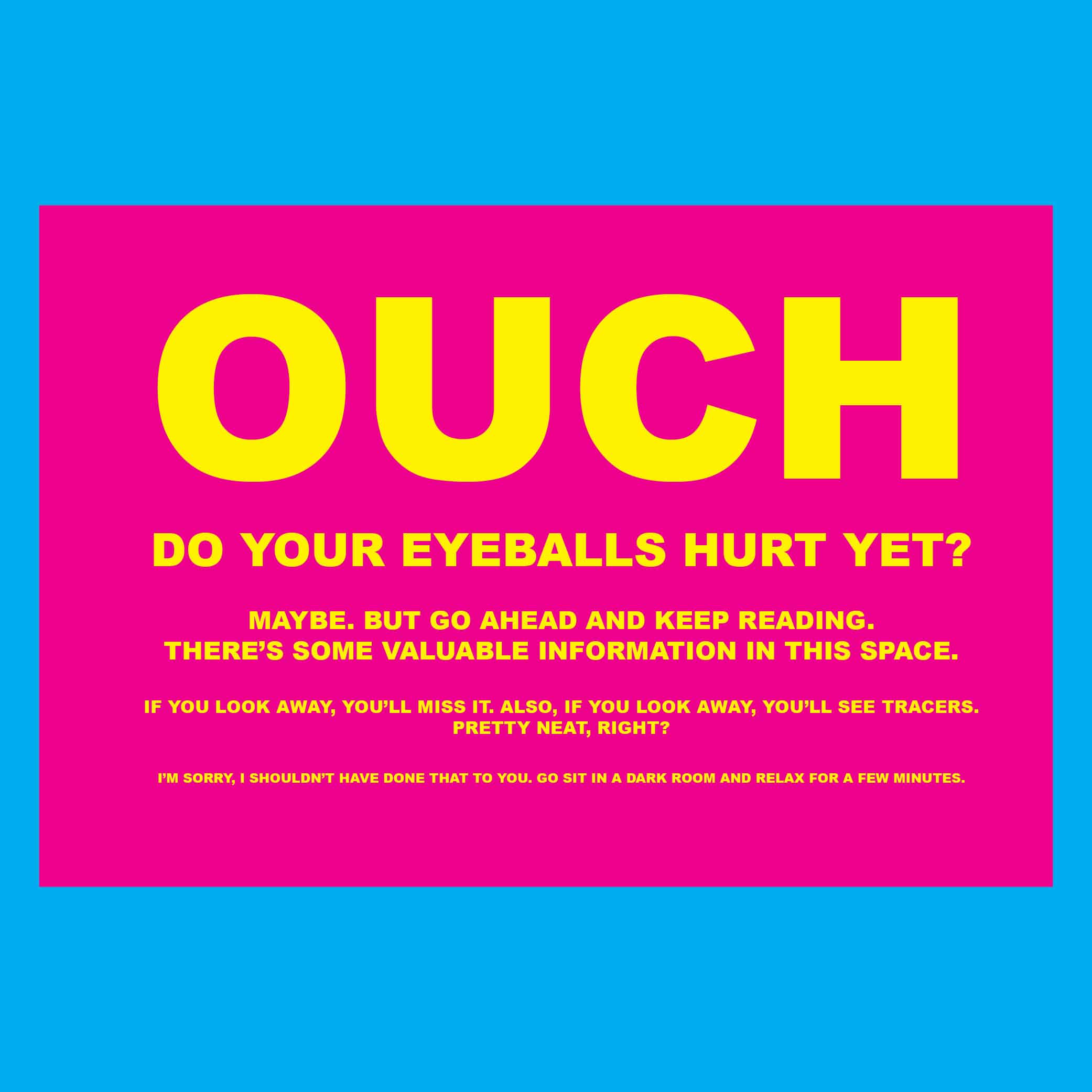
Too much white type on a black background, especially if it is small type, can be hard on a reader’s eyes. And there are some color combinations that can be punishing to pupils — bright blue type on a bright red background, for example. Basically, be careful when you are working with high-contrast colors. Use that design trick for quick glances only.

Graphic Design Tip #7: Understand your audience
A fun event for kids and their parents calls for a fun design. If your target is business leaders, fun & fuzzy might not be the best mood to set. Take time to think about your desired audience before getting started on your design. Funky, quirky, informal? Crisp, concise, formal? Should you go soft and warm, or swing a bold hammer? The audience will guide your design decisions.
Graphic Design Tip #8 Stay on brand
An organization or business likely has an established brand identity. For the most part, stick with the same colors and fonts that are part of the branding. When your design can subconsciously reinforce the established brand, you’ve done your job. You want readers to be able to recognize the design aesthetic in an instant: “Oh, I know that look! That’s Company X!”
ADVERTISEMENT
Graphic Design Tip # 9 Check spelling & grammar
This one’s pretty simple, which is why it gets overlooked so often. After you are done designing, take time to slowly go over all of the text to make sure everything is correct. Use your computer’s spellchecker, but understand that it won’t catch every mistake. Then or than? Affect or effect? Have a friend/co-worker look it over before you submit it. You don’t want a silly mistake to ruin a great design.
Graphic Design Ti p #10 Limit the fonts
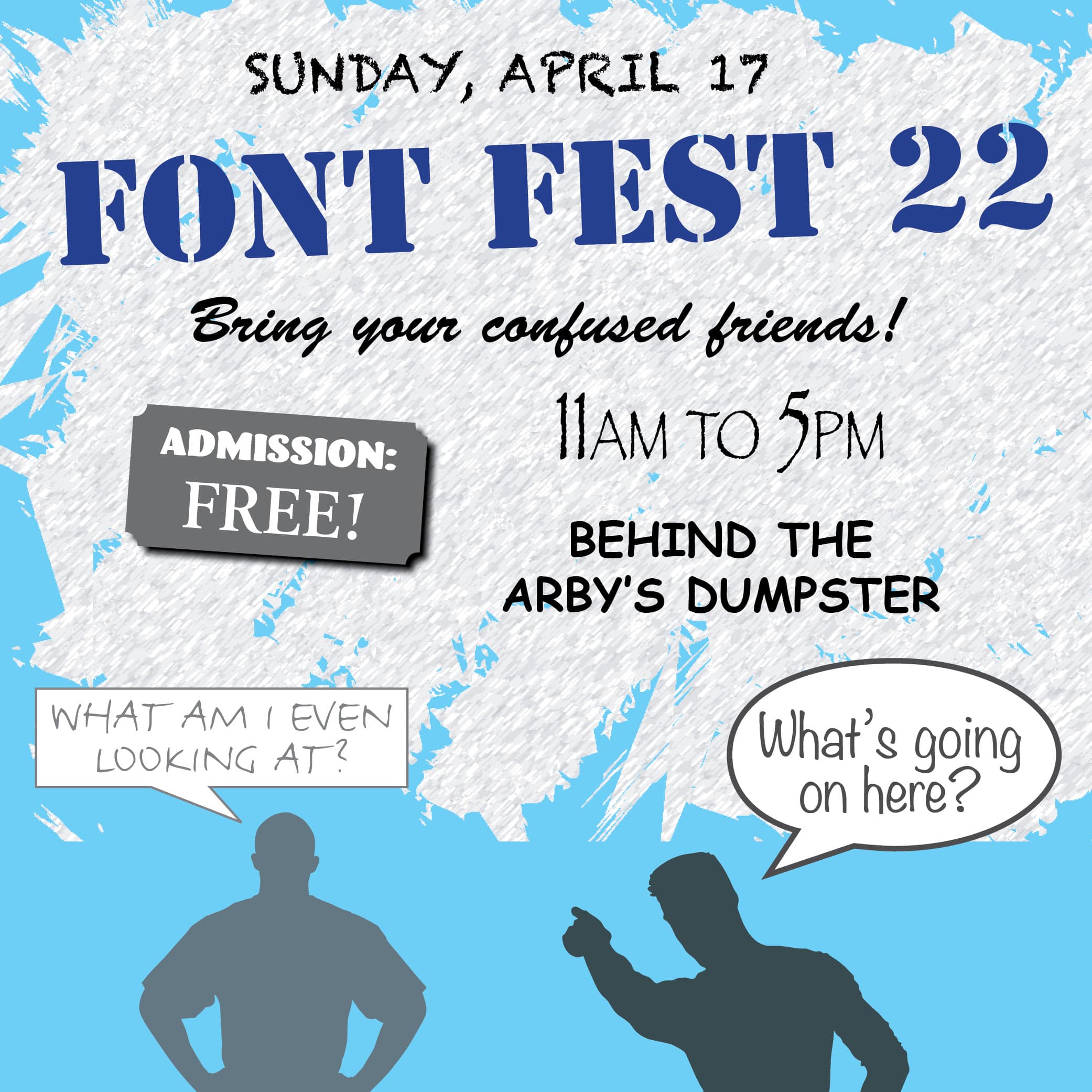
A good general rule of thumb is to limit your font use in a design to 3 or less. Choose your main font, maybe a sub-style of that font (e.g., bold or italic) and an accent font that can be used for “pop.” The accent font should be used sparingly — probably as a way to draw attention to an area of your design.

Graphic Design Tip #11: Be unique
This can be the hardest part for a graphic designer. A busy professional often has to crank out projects one after another, so there’s not a lot of time to ponder brilliant creative maneuvers. But while you’re pouring yourself a cup of coffee or taking a screen break, give yourself a few moments to consider the information and elements that will be going into your next design. Maybe you are working within the constraints of an established brand style, so there isn’t room for your imagination to go wild. But your design deserves more than just plugging pieces into a template. Find something to make it unique, whether that’s a clever turn of phrase or subtle graphic flair.
Graphic Design Tip #12: Don’t be afraid to do some research
I’ve been working with Adobe Photoshop, InDesign and Illustrator for nearly three decades. It’s safe to say I’m proficient with these programs. But then Adobe adds new features and suddenly it feels as though I’ve barely scratched the surface on learning all of the tricks and techniques these programs have for designers. Sometimes, I’ll just play around with some of the tools to see what I can come up with.

