I consider myself a creative guy — not an artist, per se, but someone who appreciates the beauty (or hideousness) of art. However, as a graphic designer in a marketing agency, I can’t get caught up in trying to create art masterpieces.
First off, time is money. I don’t have endless hours to spend creating my version of the Sistine Chapel, and clients don’t want to pay for a Michelangelo.
Secondly, marketing pieces — flyers, posters, postcards, rack cards, advertisements, etc. — aren’t the right medium for intricate designs that make the audience ponder life’s great mysteries. Ain’t nobody got time for that.
Graphic design in marketing is about simplicity. Create something that’s eye-catching and attractive, without being too busy. Present your intended targets with material that is user-friendly.
I’m going to run through some common design mistakes that can bring your marketing to a screeching halt. I probably have committed all of these errors to some degree during my career. So I speak from experience.
Consider Color
Let’s start with the most basic element of a design: color.
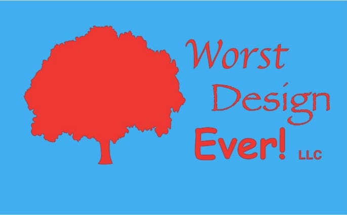
Some colors just weren’t meant to go together. Don’t put bright red and bright blue together, unless you’re trying to give people a migraine. That’s just painful on the eyeballs. It’s like staring at a light bulb — you’ll see tracers for a while afterward.
Along those same lines, if you are going to use light type on a black background, do so sparingly. That also can be harsh on your viewers’ eyes. Definitely don’t do that as your overall website theme. (I recall seeing some horrendous MySpace pages back in the day.) A simple button or bubble with light type on a black background can be useful, but people’s eyes can only handle that in small doses.
 Graphic Design Packages
Professional, convenient, flat-rate graphic design
Put Text to the Test
Simplicity works best when you are talking about text, too.
Don’t go crazy with the fonts! Try to keep your design to 2 or 3 fonts — a primary font with one or two “accent” fonts (eye-catching fonts that help you draw attention to key items/areas).
Most folks are going to give a quick glance to scan for the key takeaways. Make it easy for them. We live in an age of instant gratification, so keep that in mind. Don’t count on people reading fine print to figure out what’s going on.
If you have a ton of information you’re trying to cram into your design space, it’s going to result in an ugly and unwieldy design. Don’t hit readers with a wall of small text. Have a co-worker or business partner read through your information and see if they can help you whittle down the key points. Their input can help you create bite-size pieces of information that are easier to digest.
Keep it simple, but not that simple
To sum up: simplicity is good. That’s a golden rule with just about any piece of design in marketing.
Also, don’t use Comic Sans. Or Papyrus. Or Apple Chancery.
In about 25 years, those fonts will be acceptable to use again when creating a “retro” look that pokes fun at the past.
But only then.

The Blogger: Mike Bragg
Mike Bragg is an award-winning graphic designer and writer who spent 20 years as a sports journalist before joining Bragg Media.
Get social with us!
Like what you’re reading?
Subscribe to Bragg Media’s monthly newsletter.
